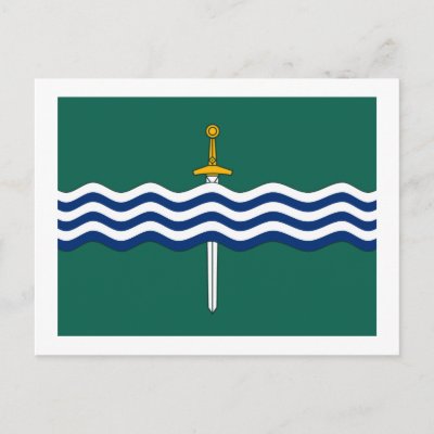
OK this is not official, I am just posting this for the sake of getting a few opinions. Our city has a flag, the flag of Peterborough. It's a green color, and has waves going across it in alternating blue and white lines, with a sword piercing the waves like this:
So I thought it would be cool totry to incorporate the peterborough flag into the peterborough logo. I tried one idea and didn't like it.
So then last night I did this design here, and it's just a rough idea, not really a finished product. I wanted to get some opinions on it before I decided if I should spend any more time even working in this direction.
So, be gentle, but tell me your thoughts on this attachment:
PTBO Blue Moon.JPG
Remember, this is just a rough idea. There is a lot of room for tweaking, but I just don't know if I should bother.
Input will be appreciated.


 Posting Permissions


 Reply With Quote
Bookmarks